What is Composition in Photography?
With the first article in our new Mastering Composition series, it is only fitting that we start off by discussing the very definition of our main topic. In this article for beginner photographers, I will outline the general meaning of the term “composition” in art. I will also briefly discuss the goal of composition, define what a good composition is and why it is such an important part of any work of art. At the end of the article I will provide you with a simple question that is also a hint on what is to come in future articles.
1) General Definition of the Term
The term “composition” applies not only to visual arts, but to music, dance, literature and virtually any other kind of art. In certain contexts, such as writing, this term may not be as widely used, but is just as valid nonetheless. In general, the term “composition” has two distinctive, yet related meanings.
First and foremost, “composition” describes placement of relative objects and elements in a work of art. Consequently, composition is a key aspect of a good work of art. There is hardly a way to overemphasize the importance of composition. Any aspiring artist ought to give composition of his work a lot of attention. A good composition is one that has just enough detail. Too few elements is bad because it robs the work of art of necessary detail that makes correct interpretation possible. It also ruins the balance of an image. And too many elements can be very distracting as well. Good composition requires good balance. It is best to make sure all the elements present are necessary for the idea or story you are trying to pass on.
In some cases, composition can mean the work of art itself and is a synonymous to that term. For example, when talking about a specific installation or dance, a phrase “This composition…” can be used. Such a definition also widely applies to music (creators of which are known as composers) and paintings.
2) What is Composition in Photography?
Now that we know the general definition of the term “composition”, it is not too hard to figure out its meaning in photography. Simply put, composing an image means arranging elements within it in a way that suits the core idea or goal of your work best. Arranging elements can be done by actually moving the objects or subjects. A good example for this case is portrait or still life photography. Street photography involves anticipation, since the photographer doesn’t usually have the choice of moving his subjects himself, but has to wait for them to take the most suitable position within the frame. Another way of arranging elements is by changing your own position. Such a way is appropriate in circumstances that do not allow the photographer to physically move anything, like landscape photography.
Composition is a way of guiding the viewer’s eye towards the most important elements of your work, sometimes – in a very specific order. A good composition can help make a masterpiece even out of the dullest objects and subjects in the plainest of environments. On the other hand, a bad composition can ruin a photograph completely, despite how interesting the subject may be. A poorly judged composition is also not something you can usually fix in post-processing, unlike simple and common exposure or white balance errors. Cropping can sometimes save an image, but only when tighter framing and removal of certain portions of the image is the correct solution. That is why giving your choice of composition plenty of thought before capturing an image is a step of utmost importance.
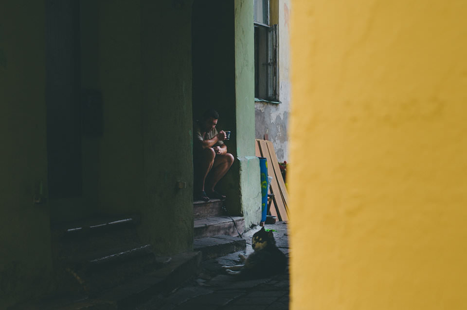
Focal length, aperture, angle at which you choose to position your camera relative to your subject also greatly affects composition. For example, choosing a wider aperture will blur the background and foreground, effectively lessening the importance of objects placed in there. It will also more often than not result in more noticeable corner shading (vignetting), which will help keep viewer’s eye inside the frame for longer. On the other hand, closing down the aperture will bring more objects into focus which, in turn, may result in better image balance. How so? Well, “sharper”, more in-focus objects may attract more attention than a blurry shape, but not always (see image sample below). An experienced photographer will use all the available means to achieve the desired result. It is worth noting that de-focusing objects in the foreground or background does not negate their contribution to overall composition of the image. Simple shapes, tones, shadows, highlights, colors are all strong elements of composition.
Take a look at the below image. Despite the fact that part of a wall showing in the foreground is completely out of focus, it is the most vivid part of the photograph as well as being quite bright. For this reason, it attracts our attention much more than the main subject (man with the tea cup and his Siberian Husky hiding in shadows). The bright yellow rectangle is the first thing you see when you glance at the photograph. A good and obvious way to fix this would be to reduce the vividness and luminance of yellow using Lightroom’s HSL panel (although I actually like the contrast between the two parts of the photograph):
We will discuss color, tone and other composition elements in more detail in upcoming Mastering Composition series articles.
Composing an image eventually becomes a very natural process. With enough practice – mind you, there can never be too much of such a thing – you will not even have to think about the placement of those elements. Your subconscious will do it for you. Your fingers will dial correct settings, your eye will guide the framing. Poor composition will instantly appear unnatural and just plain wrong to you. The more experience you have, the better choices you will make. Best way to grow as a photographer is not to rush your decisions and not trust your subconscious unquestionably, but to learn new ways of composing your image. Not that you shouldn’t trust your guts – you should, of course. But make sure to also give it some thought, experiment, take a few shots and analyze them during post-processing. See what works best, try to understand why and then experiment some more.
3) The Goal of Composition
One may assume that a good composition is one that is most pleasing to the eye. Consequently, the goal of good composition ought to be showing your subject or object in a flattering, aesthetically pleasing manner. But such opinion is a little superficial. Not every work of art is supposed to be pleasing or beautiful to the viewer. Some artists try to express different, stronger ideas and their subject, as well as composition choices help achieve that. For example, if an artist wants the viewer to feel uncomfortable or nervous, he will choose a composition that is least “natural” and come up with something unexpected and shocking. A good example of such work is war photography, where photographers often try to help the viewer feel how terrifying and destructive war is. On the other hand, an artist may portray war victims in a very flattering and disturbingly beautiful way. By doing so, he would emphasize war’s ugly nature in a grotesque and sarcastic manner. So, in the end, the goal of a good composition is to help express the idea of the artist by necessary means.
4) Assignment for Beginners
This simple assignment is for beginner photographers, who would like to actively learn along with other readers and participate in creation of these articles.
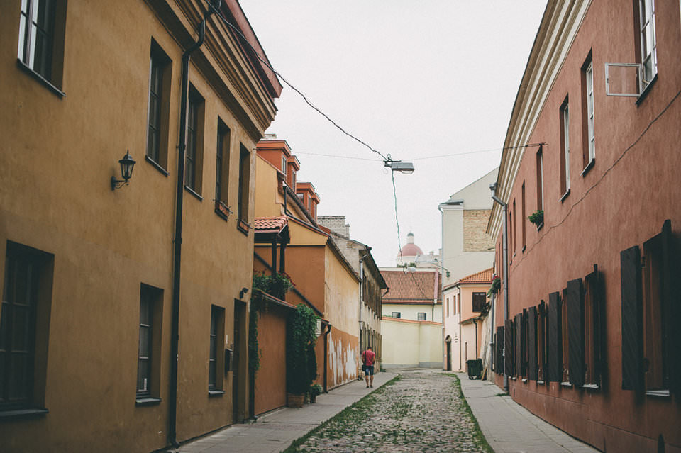
- Name basic varieties (or simply “types”) of composition you are familiar with. Make sure to list just one variety and try not to repeat those that have already been named by someone else. Best if you don’t use Google – test yourself and wait for the upcoming articles patiently 🙂 The following image is a hint for one of the most obvious basic compositions types.
Good luck!


